
Baltimore Museum of Art has a mobile web app called GoMobile to help the visitors to understand the arts by providing extra multimedia contents. The app became too difficult to use after several years of ever-growing content. We created a list of common tasks for usability testing. In our first session, only one out of seven participants completed all the tasks. But after our redesigns, we see a significant amount of improvements in usability.
Finding the Issues
After our first meeting with the clients, we know that there are two common use cases:
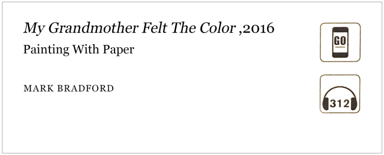
1. In-museum guide: When a visitor is at BMA, they can get more information on the art piece if there is a GoMobile icon on the label of the artwork (as seen below).
2. Remote information: When a visitor is interested in the BMA or has visited the BMA before, they can use GoMobile to get some information that they missed or things that they want to review later.
Task List
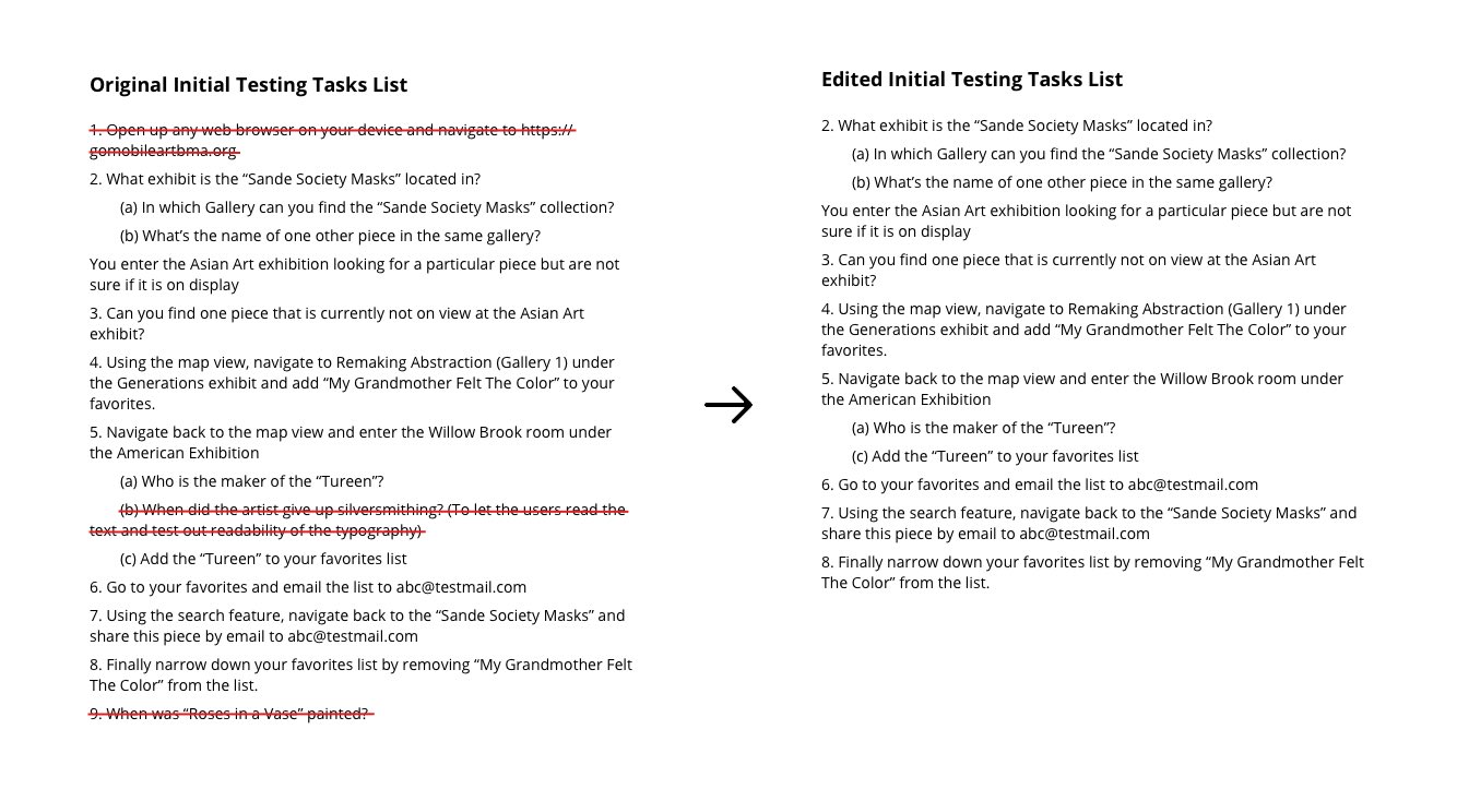
We created a task list for initial usability testing. At first, we wanted the list to be as comprehensive as possible, which resulted in a long list consisted of 13 tasks. But during the testing session, some of the tasks seemed too duplicate. So we edited the list on the go, deleting three of them.
Initial Usability Test
On the testing day, I volunteered to be the one who would find and approach to the participants and lead the interviews. To be honest, this had been uneasy for me. I got nervous talking to people, especially as a non-native English speaker who just came to the states. But I was somehow brave enough to stood out and challenged myself. The participants are all surprisingly friendly. The first participant who I approached left a deep impression on me.
He noticed my nervousness and gently patted me on the shoulder saying that it is okay since everyone is clumsy at time first time. It really boosted up my confidence and helped me to conduct the testing fluently after.
We interviewed a demographically diverse group of five participants in the museum that day, and two remote participants via Skype. Here are the results:
| Task | ATP | Success Rate | Observations / Comments |
|---|---|---|---|
| 2 | 40s | 4/7 | Users used the search feature |
| 2a | 17s | 2/7 | Users clicked on "Sande" before they can find the information on the previous page |
| 2b | 25.6s | 2/7 | Most of them could not attempt due to the previous failure |
| 3 | 36.6s | 6/7 | Most of them find them by the list. One of them use the map view and failed. Two of them initially tried to search for "Asian art" but got no result. | 4 | 54.6s | 5/7 | Three of them had clicking issues. Three of them (not identical as the last three) also tapped the favorite icon in the topbar assuming that it was the "add to favorite" icon, which was the icon for favorite list actually. |
| 5a | 17s | 7/7 | One of them did not find the galleries are clickable in map view. |
| 5c | 8s | 5/7 | Same as Task 4 |
| 6 | 11.6s | 6/7 | The first participant did not succeed due to the ambiguity of the question which was fixed in later testing. |
| 7 | 22.8s | 5/7 | One user could not find the share button. Another one of them failed for the same issue of ambiguity in questions. |
| 8 | 16.8s | 5/7 | One of them could not locate the "unfavorite" button. One of them initially had difficulties in finding the specific art piece due to the inconsistent layout. Another one of them failed for the same issue of ambiguity in questions. |
During the wrap-up interviews, a majority of our users said that the site was easy to use. We found that the search feature was very popular amongst our users. Every user had claimed that the icons were not intuitive to them. Specific examples of this we encountered during testing was that most users had complained about the map icon and one user had complained about the search icon.
Design Fixes and Second Usability Testing
We, as a team, redesign the app interfaces to solve the issues in the existing interface. Our team gathered and debated about the design fixes and prototyped the new interface using Figma. We edited the tasks list to make them more straightforward but keep it comparable to the previous one, so we can easily see the improvement. A new task for the transcript feature was also added to the list.
"Pretty easy."
- One of our participants said after tesing
Our second field tests of the improved interfaces involved 5 users. 4 of our 5 participants were successful with all the tasks given to them. Out of 7 total tasks, 5 tasks had a 100%(5/5) completion rate and the other two had an 80%(4/5) completion rate. Compared to the first round of testing, this is a big improvement. We also saw a big improvement in the average time performance for each task. In the first round of testing, we saw average times as high as 56.4s but in this round, the average high was only 19s.
| Task | ATP | Success Rate | Observations / Comments |
|---|---|---|---|
| 2a | 17.4s (+2%) | 5/5 (+250%) | Most users used the big tile on the homepage |
| 2b | 11.5s (-55%) | 4/5 (+180%) | Users seem to be familiar with the related pieces being at the bottom due to online shopping |
| 2c* | 10.6s | 5/5 | Users looked for the audio section first and then the transcript |
| 4 | 19s (-65%) | 5/5 (+40%) | Most users were confused by the map icon on the art page but eventually figured it out |
| 6 | 7.75s (-33%) | 4/5 (-6%) | All but one users were pretty successful in this task. The user who was unsuccessful tried to tap on the art pieces to select them. Can be implemented. |
| 7 | 14s (-38%) | 5/5 (+40%) | All users got through this task pretty easily |
| 8 | 8.2s (-51%) | 5/5 (+40%) | All users were comfortable with this task. One user tried to swipe to delete which is a common design pattern. |
What changes did we make to improve usability extraordinarily? We categorized the issues we found in the initial testing into four topics: Recognition, Function, Interaction Flow, Visual Design, Accessibility. I will use these categories to guide the following paragraphs.
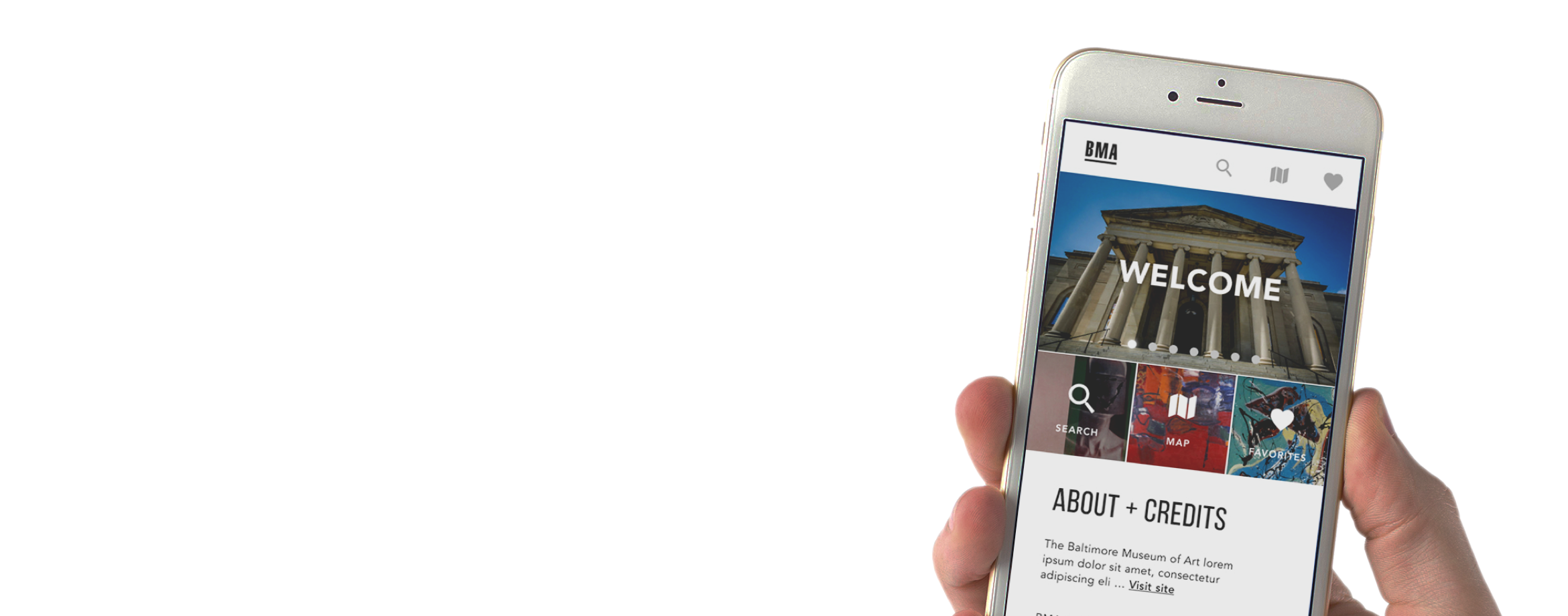
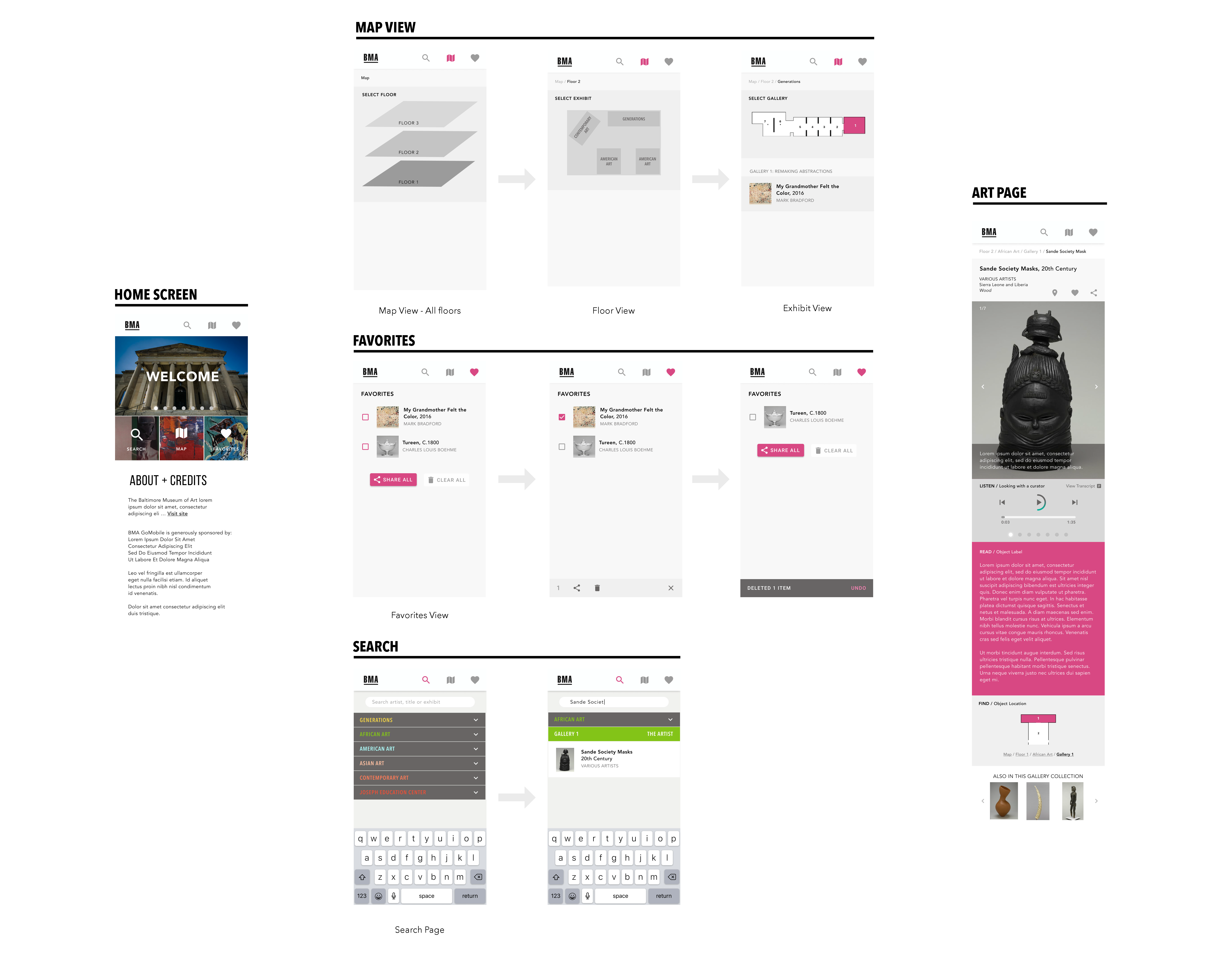
Reasonable Icon and Dashboard on Homescreen
Function: +10, Interaction Flow: +10, Visual Design: +10, Recognition: +10
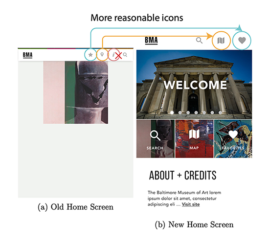
The previous home screen is a slideshow of pieces at the museum and it is not functional. We believe that a dashboard will be more useful to the users. When they feel like they’re lost, they can go back to the home screen and find all the functions they need there.
We also believe that having the developer information in the menu bar makes bad use of screen real estate as it’s not used very often. In our first round of testing one user mentioned that the icon was misleading and they believed that it gave information about the museum and not the developer. Due to this, we moved the information in the “i” icon to the home page.
In our second round of testing, we confirmed that most users prefer to use the large tiles on the homepage as it is easily accessible. 4/5 users clicked the search tile to search for something.
Instant Search Result
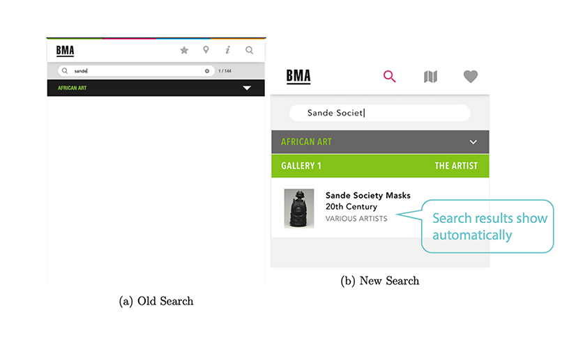
Function: +10
Previously, while searching for a piece, the exhibit is displayed but the piece wouldn’t show up until the user taps on the screen. This elicits confusion when the users feel like their search has failed or that they typed it incorrectly. This is a functional change that would improve the user experience.
Based on the better time performance for the search task(17.4s vs 40s) in the second round of testing, it’s evident that this fix we propose is effective.
Interestingly we also found that a lot of users preferred using the dropdown menu items on the search page instead of typing in the search item. We’re not sure if this is because our prototype included a fake keyboard and the users didn’t like it or if the users prefer navigating manually instead of searching.
Larger Buttons on Favorites Screen
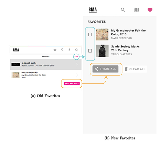
Function: +10, Interaction Flow: +1
Previously, the edit button on the favorites page was non-functional. And for a mobile interface, the button was too small to operate. The new screen attempts to fix this issue by moving the actions and making them bigger and obvious.
In our testing, only one user had problems with using the share-all functionality. The user tried to select the piece by selecting each item and then trying to share all. In our prototype, the only way to select was to click on the box. Perhaps the inclusion of the checkboxes prompted the user to check all the boxes before clicking on share all or the user didn’t notice the share all button before trying to select all the items. In addition, no users had any trouble with deleting a piece from the favorites page, thereby confirming that the design was effective.
Reorganized Art Page for Better Hierarchy
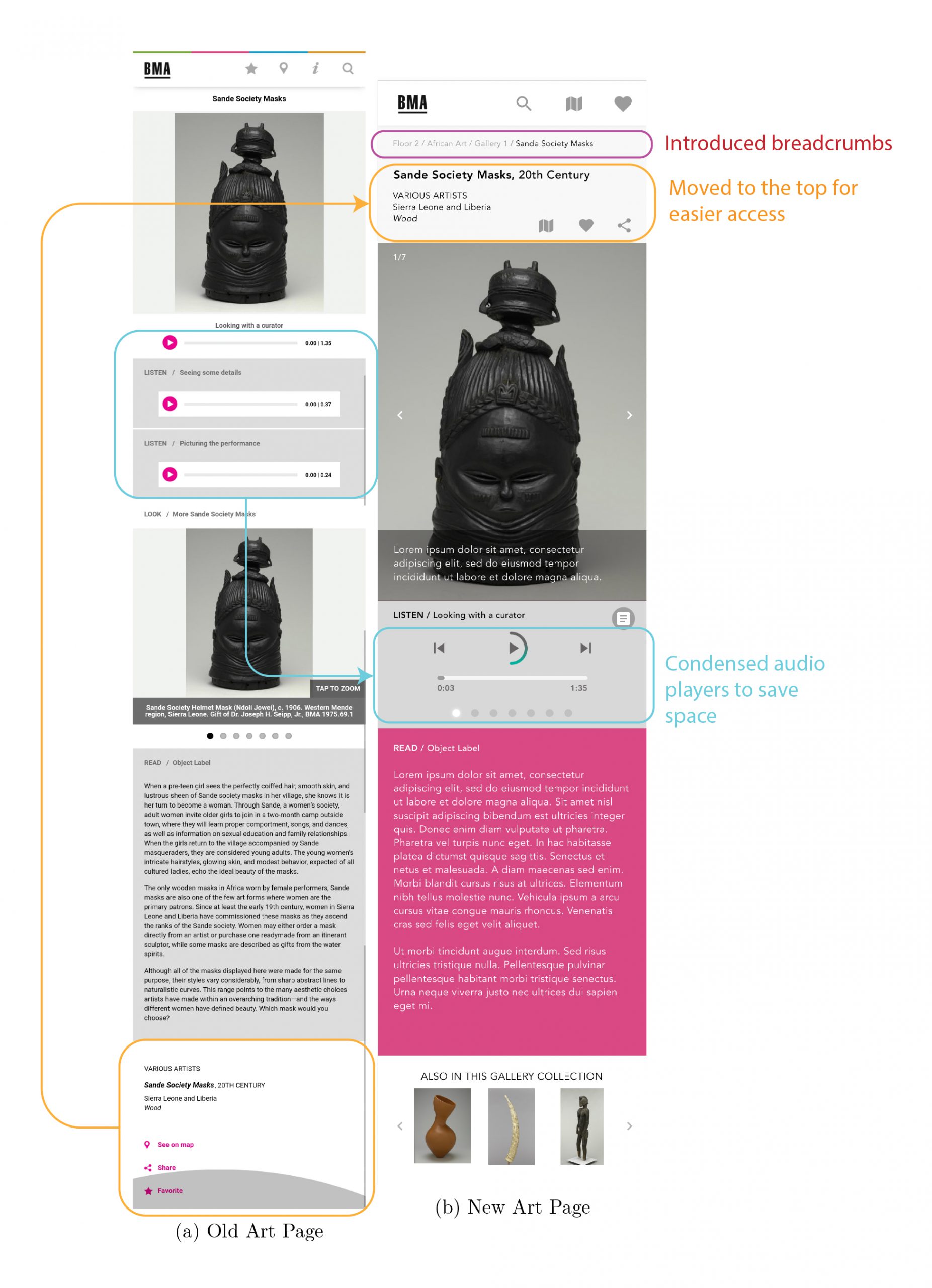
Function: +10, Interaction Flow: +10, Visual Design: +10, Recognition: +10
The art page is the basic building block of the entire site. Previously, the multiple audio files and the arrangement of the share and favorite buttons were not easy to access. The multiple audio players were not only aesthetically unpleasing, but it also increased the amount of scrolling which hindered the UX. We propose to fix this issue by adding a carousel to include all the audio players instead of having multiple players. We also moved the location of the favorite and share buttons to the top of the page for easy reachability. We also moved the additional images to a carousel on top which reduces the amount of scrolling. As seen in the before picture, a lot of the elements are redundant and the new version is more compact.
None of our users had any trouble sharing and favoriting the piece from the art page. The significantly better average time performance (14s vs 54.6s) also suggests that the design change was effective. Although we did run into trouble with having the same icon for the map view and the “locate on map” feature. This can be rectified by replacing the “locate on map” icon with a different icon.
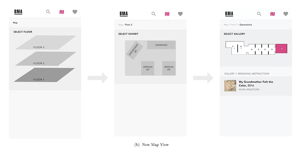
Intuitive Map View
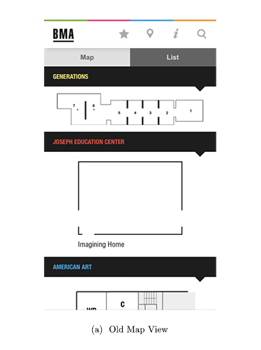
Interaction Flow: +10
The old map page is a list of maps for individual exhibit rooms and there was no affordance on the interface suggesting that users can click on the sections on the maps to navigate, which is the only way to do so. This causes quite an amount of confusion in our first testing. We redesigned the map view into a more intuitive representation of the physical space.
In our second round of testing, all of our users successfully navigated the website using this map view. Even though the icon on the art pages confuses them a bit at first, but they all figured it out quite easily on their own.
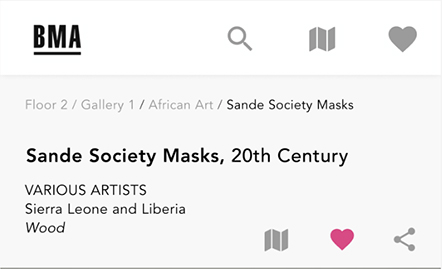
New Introduction: Breadcrumbs
Interaction Flow: +10
As shown in the figure, we also included breadcrumbs in our prototype. This enables users to identify where the piece is located, without having to go back and scroll through the list of galleries to figure it out.
In our first round of testing with the original interface, a lot of users had a problem with this task and only 2/7 users completed the task. In the second round with the improved interface, all our users (5/5) completed the task successfully which establishes the effectiveness of the change. Although the task performance was good, we noticed that some users couldn’t find this intuitively. Perhaps it’s because breadcrumbs are not often used in mobile interfaces and the users are not familiar with the design pattern. We try to fix this issue by including an “Object Location” section which includes a map and the breadcrumbs to help the user understand the location easily.
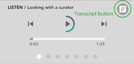
New Introduction: Transcript
Accessibility: +10
GoMobile site uses a lot of audio recordings to aid the viewing experience of the museum-goer. This presents a challenge where a hearing-impaired individual will have trouble accessing this information. We think it’s imperative to add transcripts to these audio files. Attempting to solve this issue, we added a transcript icon (top right corner in the figure).
To test the usability of the transcript icon, we designed a task in the second round of testing to see if users can locate the transcript. All of our users could locate the transcript icon but we noticed that the users couldn’t immediately understand what the icon was for. We fixed this issue later by adding text next to the button.
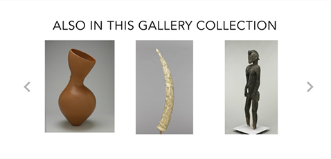
New Introduction: Other Pieces
Function:+10
In the old version, the only way to look at other pieces in the same gallery was to go back to the list view and look at the list of pieces in the galleries. This required the user to remember which gallery the piece was in and to look in that section. We believe that users will be interested in looking at other pieces in the same gallery so we added this section at the bottom of the art page.
We tested the functionality of this feature by designing a task that asked the users to find other pieces in the same gallery. During the first round of testing, 3/7 users failed this task. In our improved interface, all users that were given this task were successful. Most users seem to be familiar with the design pattern of having similar objects at the bottom due to online shopping so they immediately scrolled down to find it when the task was given.
Final Design
Conclusion
Through this exercise, we also realized the problem with assuming how the user is going to behave. We made a few design changes expecting the user to behave in a certain way, but the testing showed us a different picture - highlighting the importance of testing with actual users.
Personally, for me, I gained so much experience in interviewing users. I used to fear to lead the interview worrying so much about making mistakes. But it turned out to be much easier than I thought.
Also, I learn so much about social interaction. Before, I was so not confident in approaching random people because I was always concerned by the cultural differences and my existing skills in socializing going invalid. But it turned out that there weren’t that many differences between cultures. I still remembered our first participant, who encouraged me when I was nervous. His encouragement broke the imaginary wall of mine, using the power of empathy. Across the wall, I saw the connection between one human to another. That’s when I realized that cultures might look distinct on the surface, but they are still the same at the very core. After that, my confidence in socializing is significantly boosted with that belief in my mind.