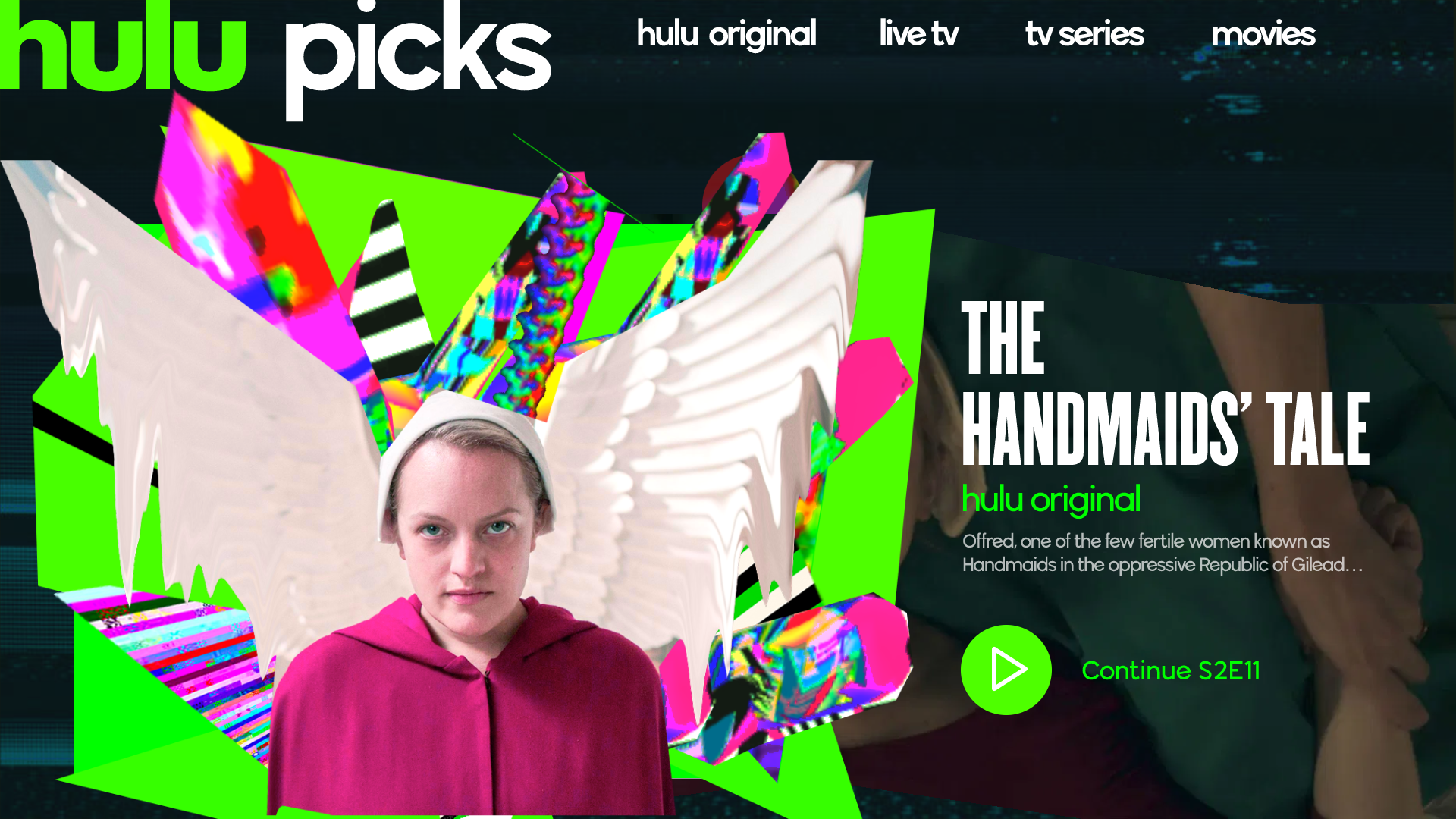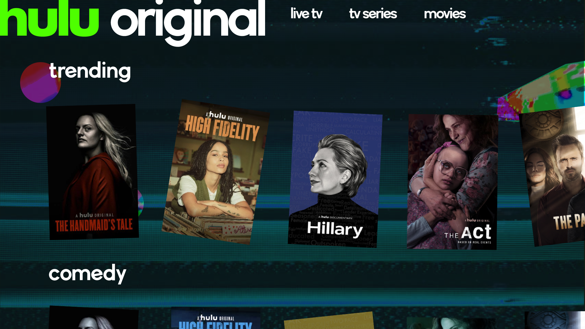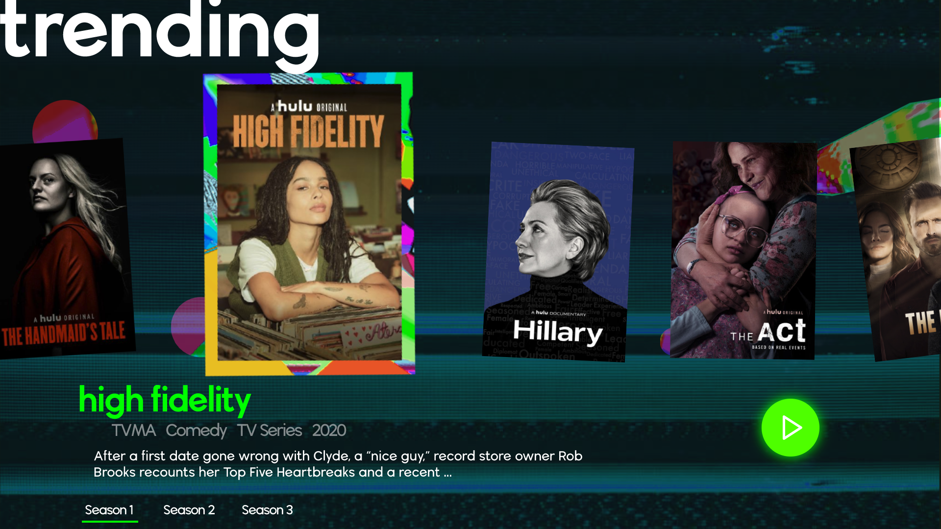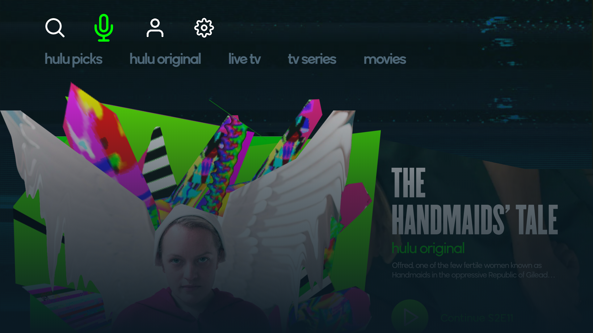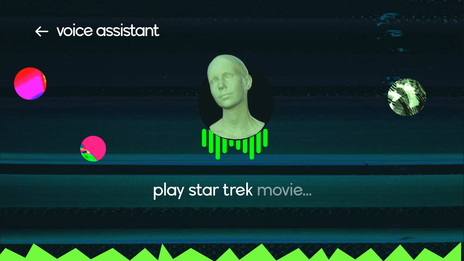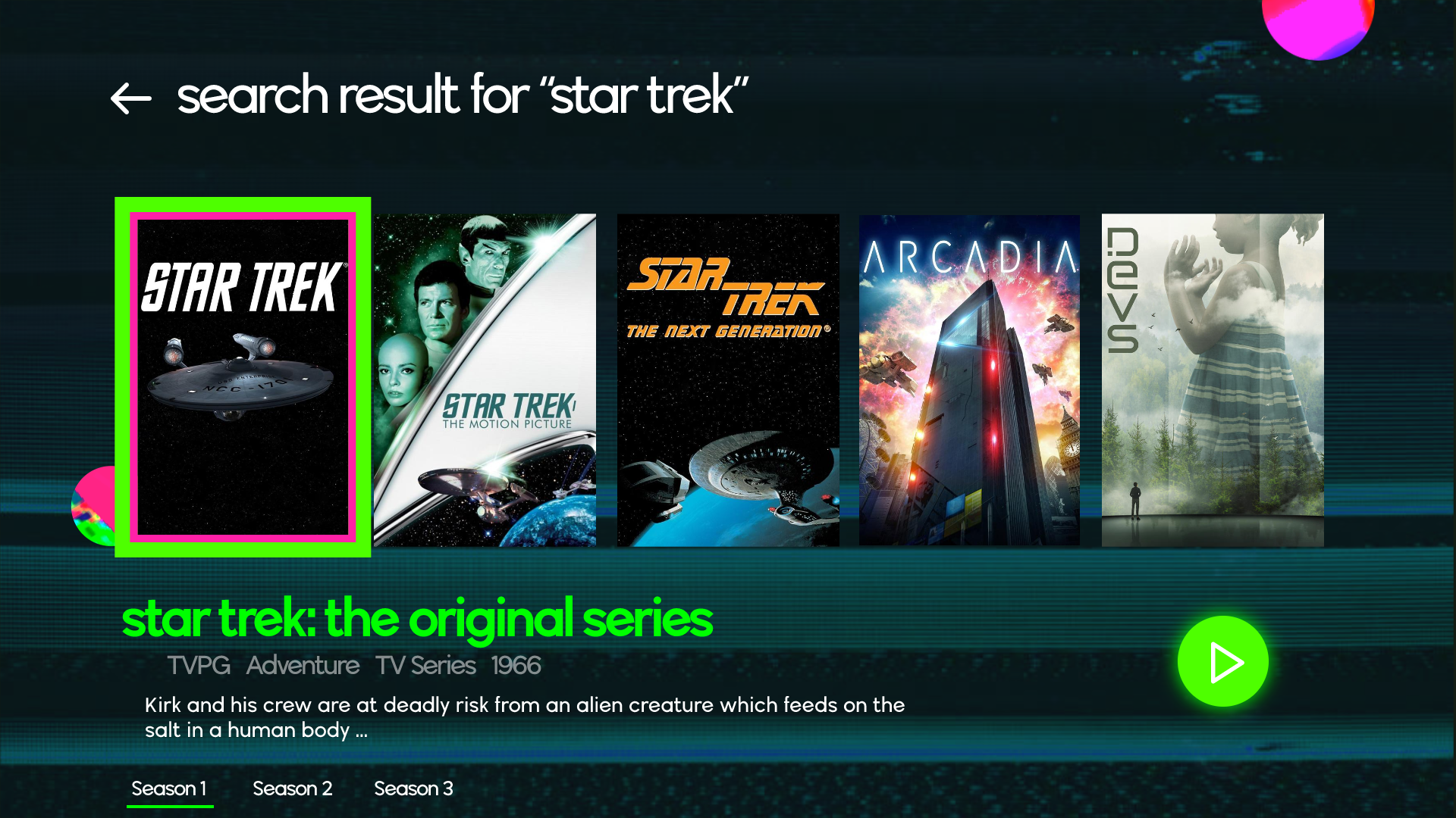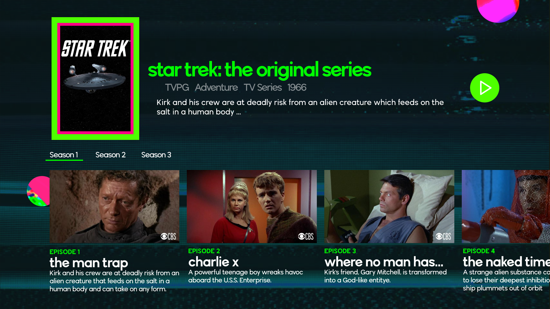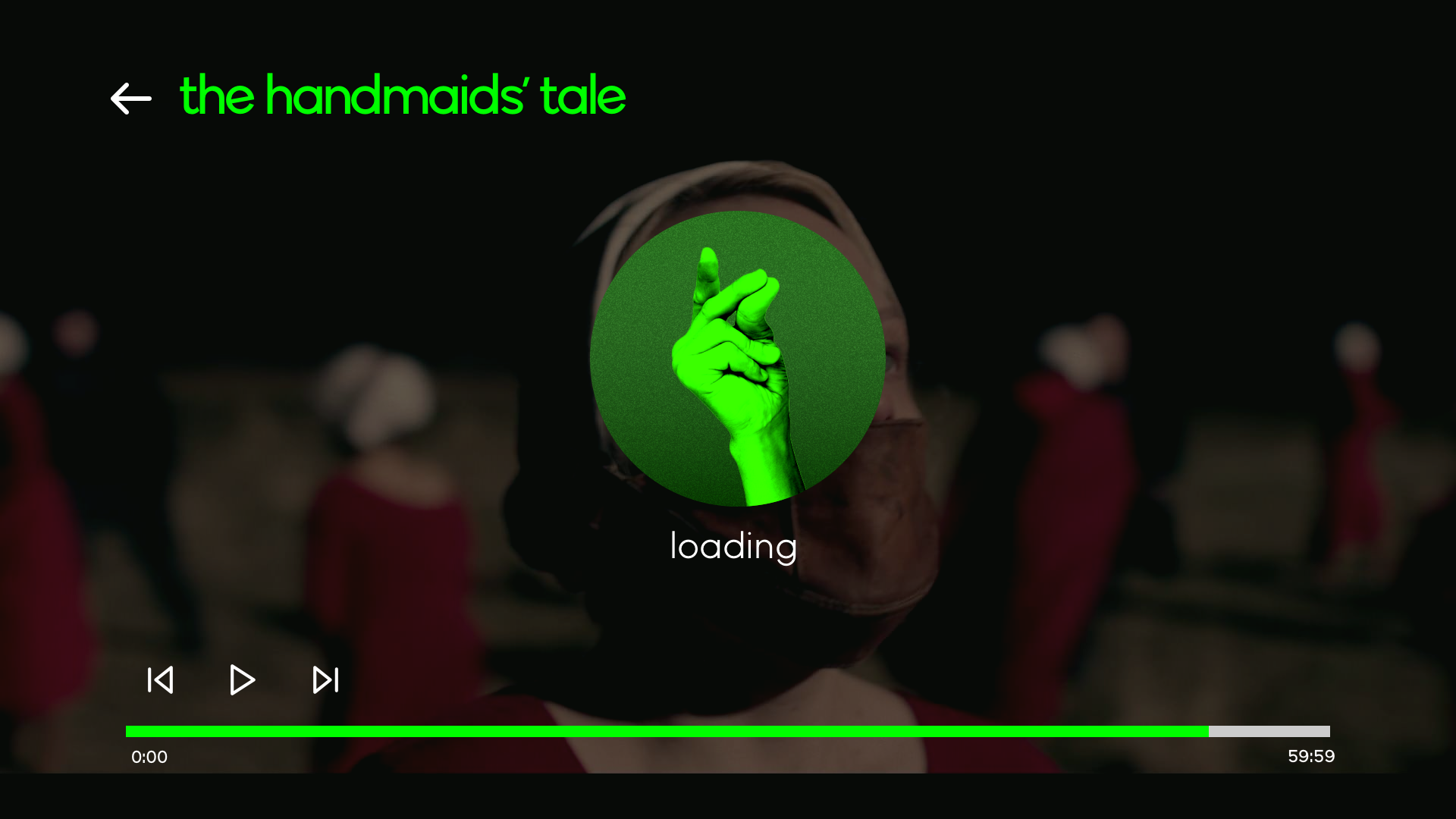
I started this project by comparing Hulu with its competitors: Netflix and Amazon Prime Video. After reaching their mission statement and visual strategies, I came up with _a spectrum of fun_ of streaming platforms. I found out that Hulu is the most entertainment-oriented among the three both in terms of mission statements and in visual language. So I began to think, what if we push that fun aspect to the extreme?
spectrum of fun
visual strategies
Hulu is an online video streaming platform. What distinguishes it from Netflix and Amazon is the fun aspect of their culture. In their mission statement, they do not talk big about humans or the world. They define themselves as a pure entertainment company. This let me come up with a set of fun-centered strategies.
entertaining
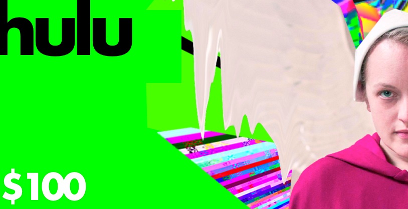
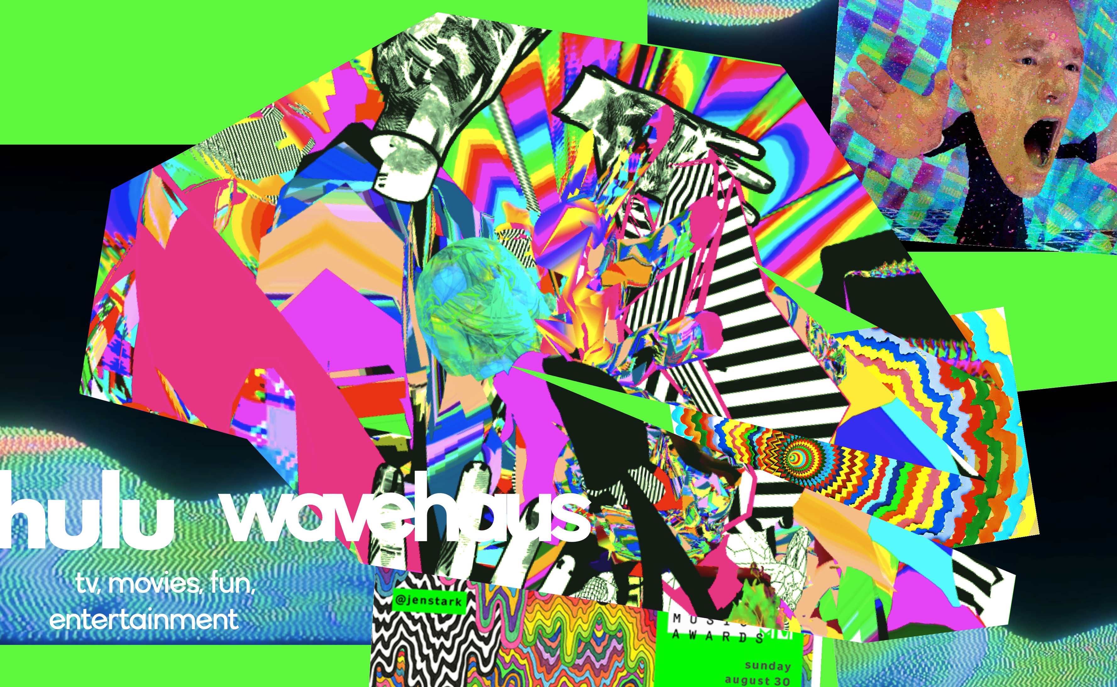
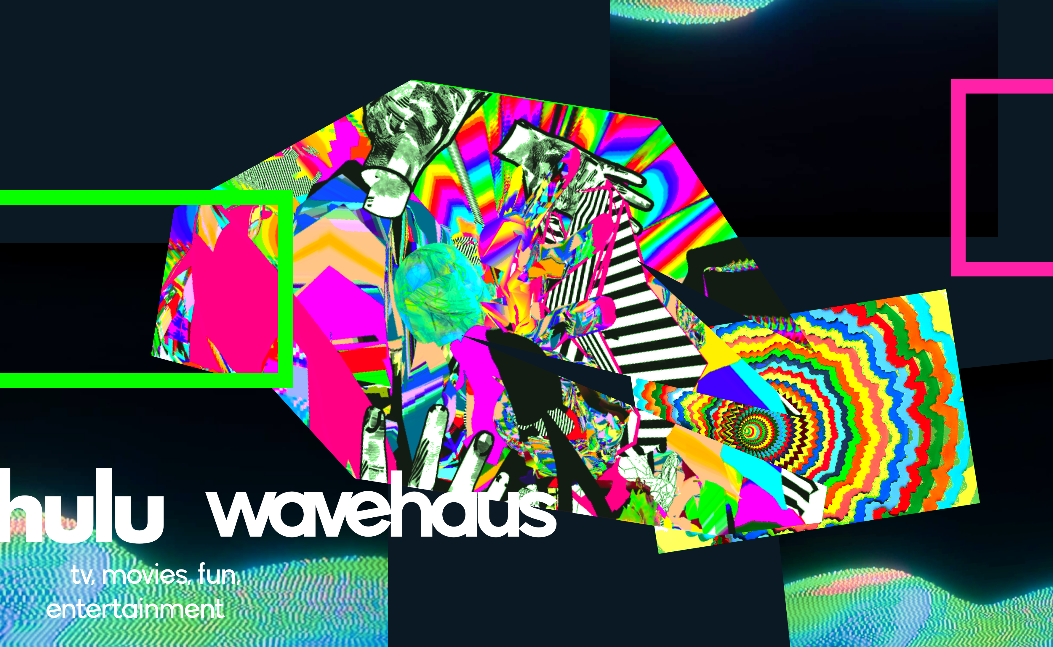
The design uses numerous glitch art elements with extra vibrant and contrasting colors. Unconventional design patterns can give users a fresh feel. As for typography, geometric font with a more x-height ratio is preferred, and letters will be all lowercase.
lively
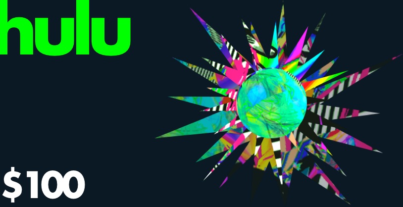
The design features sharp edges to convey an energetic feel. Jumpy layouts can bring a lively tone. Decorations will be in outward directions, emitting outgoing personalities.
utilitarianism
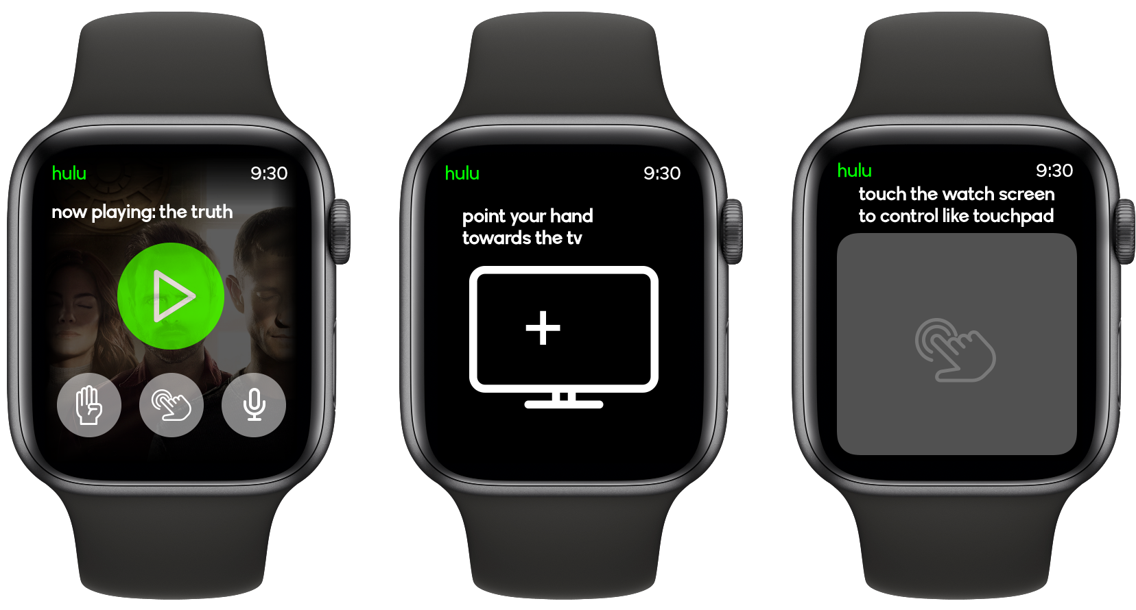
The former two strategies can cause usability issues. Therefore, trade-offs have to be made. We can implement Intuitive ways of remote control. Contrasts in visual design also facilitate usability.
mood board
The redesign visual strategies make Hulu the MTV of streaming platforms. Based on this idea, I researched a lot of MTV visual design language. The glitch-art period is my main resource. Artists like Antonio Roberts have heavily influenced my design, especially the mood board.
redesign and rebrand
